I’ve always been intrigued by double exposures. The first time I saw this process I was enamored by how visually stunning the outcome could be. However, it is much more challenging than I initially expected and getting the results always came back to the most fundamental aspect of photography, light.

Double Exposure of Roya on Kodak Portra 400. Shot on Mamiya RB67, 90mm
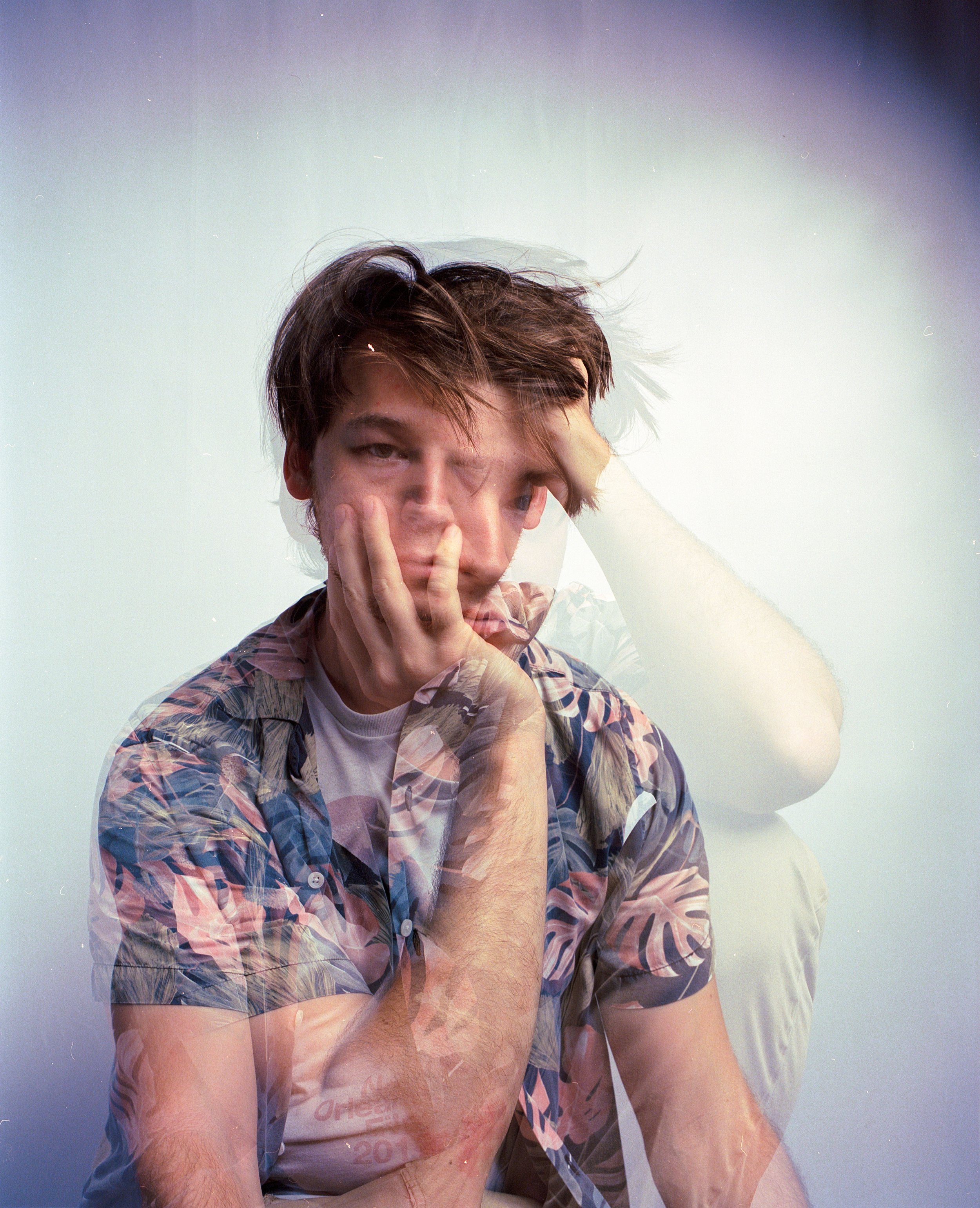
Creating a strong Double Exposure proved to be a challenge because you have to have a strong visualization of the photo you are trying to achieve before you even load the film in your camera. My inspiration behind this first project was the album artwork for Mac Miller’s Circles shot by Christian Weber. I don’t know if that work was shot digitally or on film, regardless, it remains as one of the most visually stunning double exposures I’ve seen. Now for this first project I was merely trying to imitate what I saw in Weber’s work so most of the visualization was done for me and not by me. The challenge in this project came down to composition and trying to visualize how each image would appear superimposed on top of the previous image.

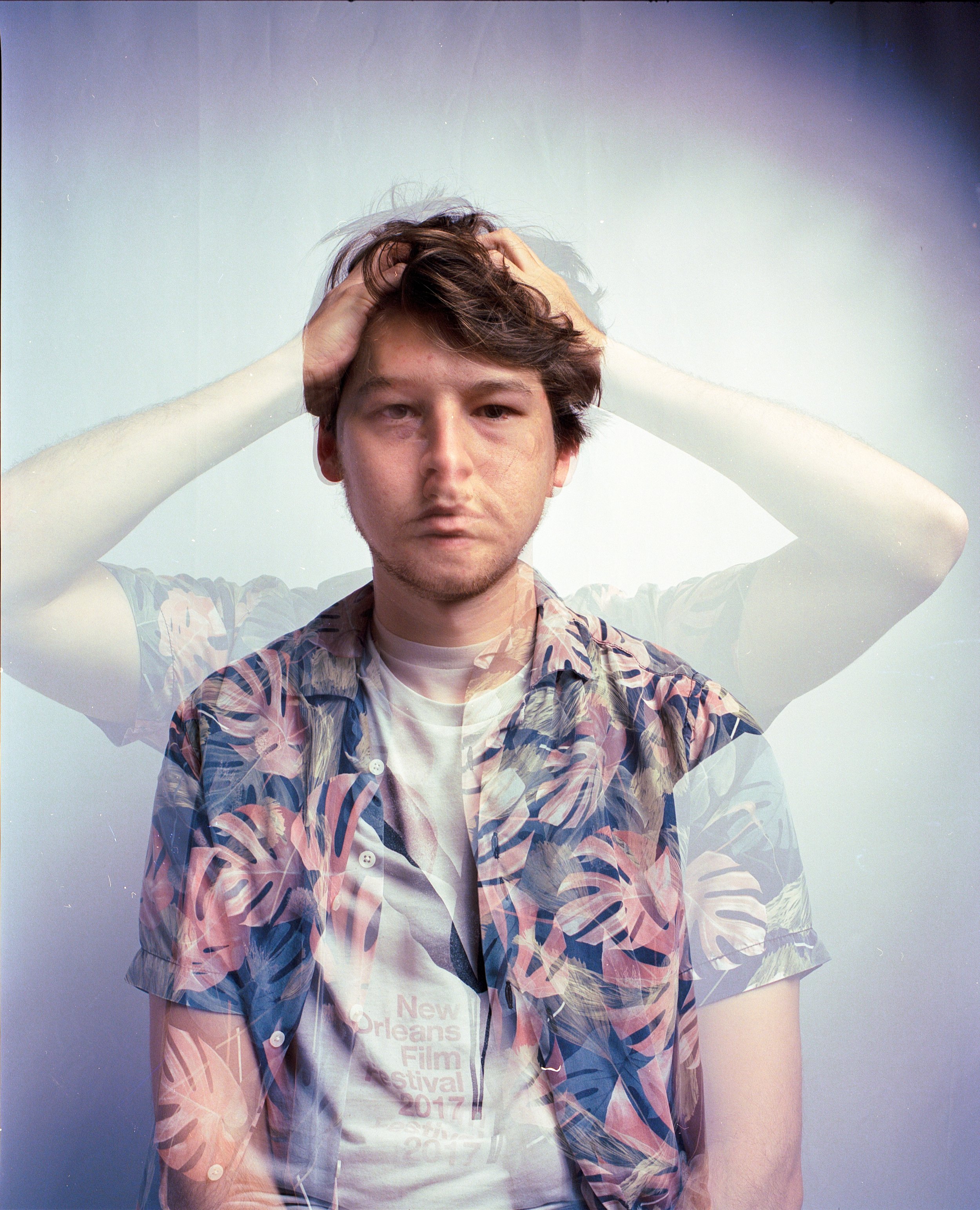
Double exposure of Ian on Kodak Portra 400. Shot on Mamiya RB67, 90mm
For this project I only used one light source as my key light and a bounce for fill lighting. My light source was a Godox AD200 Pro with a octagonal soft box for diffusion. The areas where a dark base overlaps a light one lead to better exposures, as seen with his finger and hair. This is something that I would expand on as I garnered a better understanding of the process with my later project. A drawback of this project was the way I utilized my lighting. I was lighting each image as if it was a standard portrait. However, with double exposure you have to make use of the areas that will be underexposed in the images so you can superimpose the next image on top of that underexposed area. Another key aspect of creating the final product is knowing exactly where each pose will land in the frame. What worked for this project was the different poses for each shot in the double exposure; what didn’t work was the lighting.
Project #2 Double Exposures using gels
I started to understand the double exposure process a little more and where you could really go with them when I came across a photograph by Tarek Mawad on Instagram. This photo is a great example of how to utilize your underexposed areas to create a visually stunning double exposure. For my second double exposure project I wanted to see how I could utilize those areas to create an image. However, going into the project I did not have a clear image I wanted to ascertain so it was more of an experiment in lighting and color. On top of that, I also decided to add some color gels into the mix for my lighting sources. I wanted to see how one color would react with another when layered in a double exposure. My lighting sources were my Godox AD200 again and also an off camera speedlite. Each strobe was linked to a transmitter/receiver on my Mamiya with differing color gels.

Self Portrait on Kodak Ektar 100. Shot on Mamiya RB67, 90mm
Another challenge of this project was color correction. When I scanned the developed film the color did not seem to be rendering properly and since I was using colored gels there wasn’t any white point for me to base my color correction off of. However, I think I came pretty close to the true colors in my final edits. For this first shot I used split lighting for the yellow gel that way the left side of my face would be in complete darkness, leaving a blank canvass for the second exposure. I would have liked to have used more diffused lighting for the yellow gel but I think it gives a nice contrast between both of the images with one being soft light and the other being hard light. I was pretty surprised to see that the colors did not have too much of an affect on each other as I had initially presumed they would but this could just be due to differing levels in luminosity between the strobes. I’ll go more into this idea in the next section.
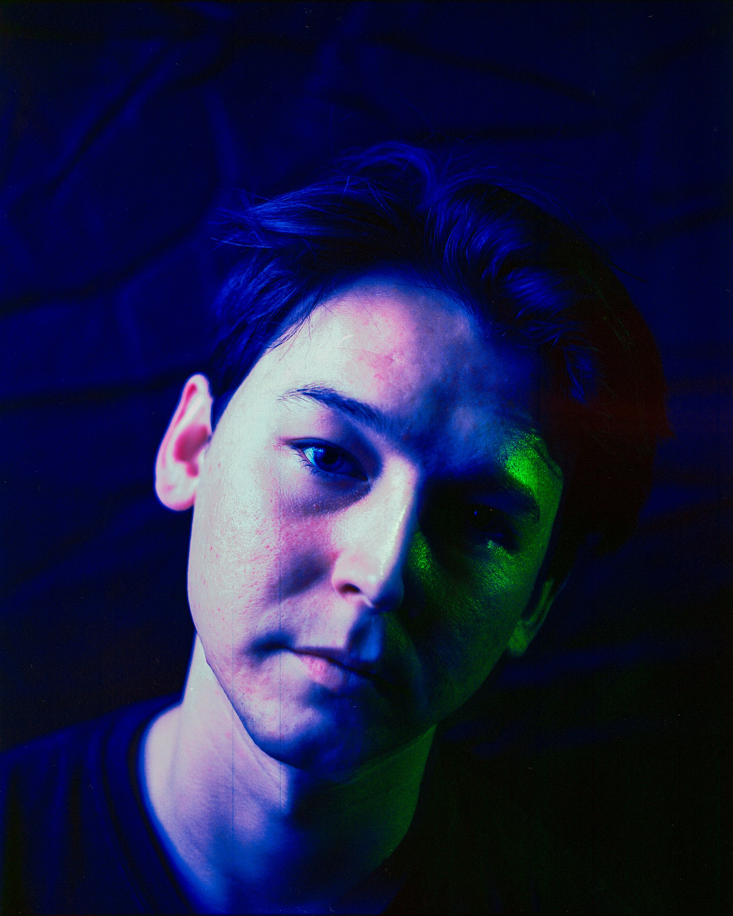
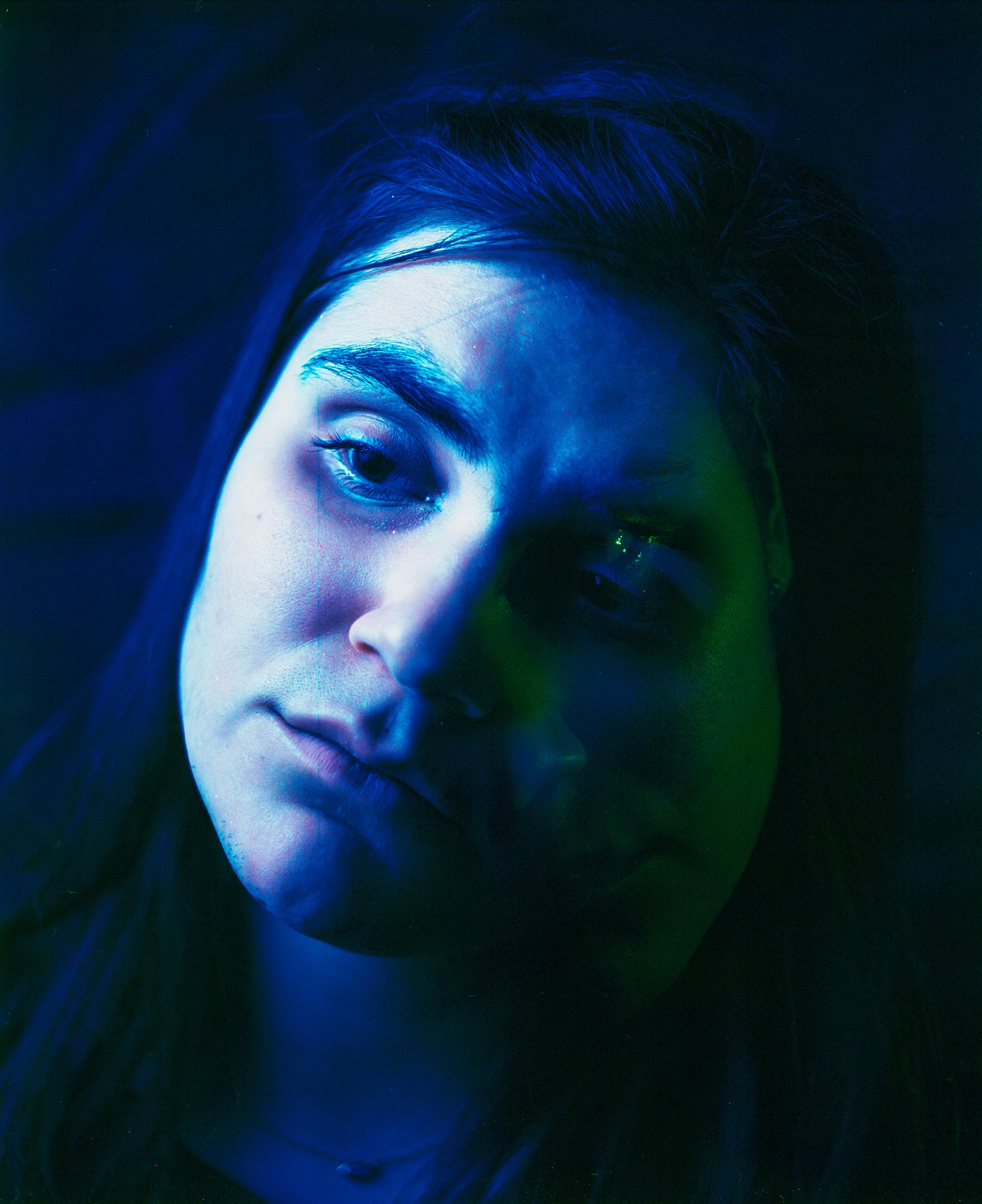
The self portrait here in the first slide is much better lighting wise. The green strobe had much more powerful light coming out of it than the second image does. I think where the problem occurred was either I changed my lighting set up a bit and set my strobe farther away, I weakened the output, or that green gels cut more light than other gels. Let this be a lesson in always keeping a photo journal on you and tracking data so you can see why your images render the way they do. It’s very difficult to tell that the first slide is even a double exposure because my pose in the image did not change as drastically as the pose in Roya’s portrait. Once again in these two images the colors don’t appear to mesh as much as I initially expected but I’m assuming that’s due to me using split lighting rather than lighting the whole subject evenly. Next time I attempt to use gels in a double exposure I’ll try to focus less on underexposing certain areas and expose the subject’s entire face. In fact, it might be easier to experiment with gels with still life photos rather than portraiture since it will be easier to control the subject. The final shot that follows was my personal favorite and the one I feel rendered best.

Ian/Roya Double exposure shot on Kodak Ektar 100. Mamiya RB67, 90mm
There’s plenty of reasons this one’s my favorite. First and foremost is that it’s a double exposure of me and my girlfriend and visually it translates what being in a relationship is like: two people with different personalities melding into one. Granted, this image does have some odd qualities to it that gives it this alien and otherworldly feel. There’s almost a Frankenstein’s monster quality to it as well, not that I feel that way about our relationship but visually it has this uncanny feeling to it. That’s how relationships can be at times, though. You’re trying to fit the pieces of your personality together and make them work harmoniously but at times they can also clash. It’s the honesty of this portrayal of a relationship that I like most that it’s simultaneously divided and unified.